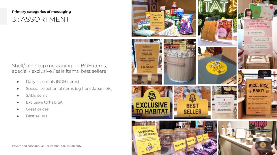
Clear signs, happy shoppers: Fixing visual overload

Harnessing user research and teamwork to revamp in-store messaging (ISM) at habitat by honestbee — UX Case study (6 min read)

Picture this: You’re rushing to get a drink in the middle of a store bombarded with colourful promos and countless signup stickers. Yeah, not exactly peak shopping experience. That’s what happened at habitat by honestbee — our once-sleek fleet of UX signages now drowned amidst a sea of visual noise.

Any growing cross-functional outfit knows this will happen… over time. It’s easier to just shrug it off and let chaos reign. But hey, if you’re a proud UXer, you cant help but want to champion user-centered design.


This case study dives into my team’s journey, armed with the power of data analysis and teamwork. We didn’t just clear the visual clutter, we created a streamlined in-store messaging (ISM) system. Business KPIs met? Check. Clear yet engaging shopping experience? Double check.

habitat by honestbee, author standing beside UX lead and other team-members paired with Concierge staff
SINGAPORE (Jan 2019): I spearheaded a “Concierge Bee” (CBee) initiative, where my UX team at habitat by honestbee spent 8 weeks shadowing the Concierge staff. Working in pairs for 2-4 hours weekly, we documented customer pain points and identified app & retail/dining improvements. This fostered user empathy and informed our digital product vision.

Project in brief

COMPANY
honestbee is a Singaporean tech company that revolutionised online grocery shopping in Southeast Asia. They offered convenient delivery services and connected customers with a wide variety of fresh and specialty products.
PRODUCT
habitat by honestbee is the company’s ambitious foray into physical retail. Launched in Oct 2018, it was a multi-faceted experience – a full supermarket, specialty grocer, online fulfillment center, and interactive dining destination all rolled into one.
PROBLEMS
Overwhelming visual clutter due to inconsistent messaging across departments. To improve the poor customer UX, I initiated cross-functional collaboration, comprising workshops, discussions, and creation of a consistent visual language system for habitat and future projects (beePoint).
RESULTS

The ISM system categorised message types and design templates. Clearly-define scopes for each department also allowed for ongoing collaboration. The streamlining exercise resulted in a clearer, more organised shopping experience for habitat customers.

‘Grammable moments

Oohs and aahs… viral visual stories flooded social media hard back in 2018. When new-gen retail & dining destination, habitat by honestbee launched, our whole team felt that delivering a vibrant in-store experience DAILY was critical. Hello, yellow! But what happens when good intent led to visual overload?

Back when bee land laid barren. Yes, early UX wayfinding explorations to onboard customers prior to the big opening.

One afternoon, I stood paralysed. I witnessed how our first set of cleverly-designed instructional UX signages now were overshadowed by a blinding wave of luminous lemon-kissed instals from other teams (VM, logistics, inventory, etc). All stood eager to POP and contribute to a vibrant customer experience.

A cup of coffee double-shot later, I soon realised we were presented a UX opportunity: to champion clarity above clutter. 

For this initiative to work cross-functional collaboration was needed. I’m no stranger to making new friends now, innit? My gameplan comprised a mind-numbing visual audit along with my UX lead, data analytics and open communication with other departments. We partnered with various teams and in a few short weeks, we co-created a dynamic in-store messaging (ISM) system that sufficiently addresses each team’s business needs while bringing clarity back to the shopping experience.  

Data detective on duty

I didn’t really have strong industry background on consumer habits and grocery trends back in school. Specifically, retail psychology. In fact, I was still pretty new to this physical-digital UX hybrid (just around 7-8 months in), but the mounting risks from customer confusion fueled my curiosity.

Also, let’s face it. I was wildly driven by the need to save my UX team’s hard work from drowning in this chaotic sea of canary, let’s just say that. So, I dug in.

Content audit. I conducted a very detailed visual audit, meticulously documenting the existing signage landscape. Table sticker, decal or standee, you name it, I got all of ‘em. It was like a visual census, counting and categorising every sign, banner, and wobbly display. No bee was safe.

Blueprints. Thanks to my architect parents, I wasn’t a newbie when it comes to reading and analysing interior spaces. With the actual store blueprints on hand, every shelf, table and designer chair were accounted for in my updated floorplan.

Down the retail rabbit hole
Next, I dove right into research on in-store messaging best practices. I looked up publications like the Grocery White Paper (2008, by the Time Use Institute), and POP Trends 2016 (Path to Purchase Institute). Studies on banner blindness (the phenomenon of customers tuning out overwhelming signage) became my new bedtime reading.

Plans of launching smaller, convenience-store-like beePoints across Singapore were in the works so I had to keep that in mind, too. Behavioural patterns unique to scale or location were potential issues and areas I had to cover.

Time-poor c-shoppers (2017) published by William Reed Media shared an interesting statistic. I read, “The average time needed to convince shoppers to view store displays is 0.9s.” For time-poor c-shoppers (found at potential beePoints), that’s even lower at 0.3s.

Going the extra mile
In the evenings after work, I made trips to the city, scavenging for ISMs deployed across Singapore’s retail spaces. From small convenience pop-up stores to large shopping haunts with high foot traffic like Isetan, Tangs, IKEA (Tampines) and Vivo City.
I took notes on how these places executed fairly crafted ISMs. Extra points for those that delivered coherent brand experiences among casual visitors and target shoppers alike.
Oh boy, sparking joy
Buzzing with knowledge, the data painted a clear picture: we needed a strategic messaging overhaul. Here’s the tentative plan I had so far.
  1. Categorisation is key. We needed to group the existing ISM into distinct buckets.
  2. Colour. Each category could be assigned a specific colour based on colour psychology principles. For example, neutral blacks for instruction and wayfinding to guide customers with a sense of ease.
  3. Design language that speaks volumes. Consistent typography, visuals, and layouts would be tailored to each category.
Cross-team collaboration

Sure, I had the plan, but getting buy-in from other teams was a must! So, together with my UX lead, we workshopped our ideas and presented our data-driven findings to the other teams separately (i.e. in-store Logistics, Visual Merchandising, Customer Concierge personnel, and Brand & Marketing). I facilitated open discussions across several days. The collaborative brainstorming sessions sealed the deal – everyone was on board!

With UX setting the example, each team were tasked to contribute and own their distinct ISM visual style. We all agreed, the clear guidelines put in place helped reduce overlaps and message dilution.

The impact? A visual oasis

The streamlined ISM system transformed the store environment. Gone was the yellow overload, replaced by a clear and organised visual language. Customers could now navigate with ease, understand product information at a glance, and actually see the messages we intended.

Bonus. Industry benchmarks suggest clear signage can lead to a 5-10% increase in conversion rates. While we didn’t have access to specific store data at the time, the positive customer feedback and smoother shopping experience were clear indicators of success.

Key takeaways

This project was a masterclass in user-centered design and the power of collaboration across teams. It also showed that even a UX/UI newbie with a thirst for knowledge (and a healthy dose of “energizer bunny” spirit!) can make considerable impact on improving daily shopping experiences.