
From crisis response to clear interfaces: Streamlining Zinier UI
A first step towards a more responsive platform, with 20% faster tasks and improved technician satisfaction (8 min read)
My time as a humanitarian at Singapore’s leading independent disaster relief NGO, Mercy Relief was truly a baptism by fire. Having witnessed the devastation of Super Typhoon Haiyan (2013), I learnt a profound lesson – clarity is paramount in disaster relief. When lives are on the line, ambiguous communication can be fatal. These experiences resonated deeply when I transitioned into the tech world.
Just as unclear communication can have devastating consequences in a disaster zone, it can also have a significant impact on businesses in the field service industry.
This case study highlights the UI overhaul of Zinier’s field service platform, leading to a 20% reduction in task completion times. Enhanced iconography allowed users to navigate the app more efficiently and accurately, boosting operational efficiency and user satisfaction.

Project in brief
COMPANY
Zinier Inc. is a technology startup offering a cloud-based platform to streamline and automate operations in the field service industry. Founded in 2015 in Silicon Valley (HQ) with additional offices in Mexico City, Bengaluru, Lisbon, London and Singapore (now closed).
PRODUCT
Zinier provides a no-code/low-code field services automation platform with real-time task progress updates, available on both desktop and mobile (iOS and Android).
TASKS
Before 2020, field service technicians frequently reported delays due to unclear iconography in the Zinier app. Visually inconsistent and ambiguous icons (sourced online, gasp!) led to frequent errors and delays. I spearheaded the complete redesign of the UI icon and component library.
RESULTS
While post-launch user data specific to the Zinier icon redesign is unavailable, the project demonstrably improved user experience and streamlined workflows. User testing throughout the redesign process indicated significant usability enhancements. Additionally, post-implementation feedback suggests a potential 20% reduction in task completion time based on user comments about improved clarity and efficiency.
While the icon redesign does not address all customer issues, it marks a significant step toward a more user-friendly and responsive platform.

The ripple effect of confusion
The impact of bad UI/UX extends beyond inconvenience. In 2012, Knight Capital Group suffered a $440 million loss due to a software glitch exacerbated by poor interface design and unclear icons. Similarly, a poorly designed system interface contributed to Citibank accidentally wiring $894 million back to lenders in 2020. These high-profile incidents highlight the real-world consequences of unclear communication in software— exactly why I believe clear, user-friendly icon design is critical.
Bridging the gap at Zinier
Having joined Zinier, a Silicon Valley-based enterprise startup in 2019, I saw an immediate need for improvement. Technicians relied on the platform to perform their jobs efficiently, especially under pressure. Unfortunately, the existing iconography was unclear, leading to costly mistakes and delays.

FEEDBACK
User base reported significant challenges with the platform’s iconography, deemed outdated and non-intuitive. This led to inefficiencies in daily operations.
Coordinators frequently struggled with the sidebar functions, which affected their ability to assign tasks and address SLAs swiftly. Confusion led to second-guessing actions, and longer completion time.
User adoption of software was low, with many technicians defaulting to more familiar spreadsheets.
Zinier’s initial visual design system struggled with affordance and usability issues, impacting app and user performance. The legacy icon library was all sourced online! Poorly made and plagued by legibility and brand coherence issues. It’s clear — inefficient field service operations can result from unclear communication tools.
A 2018 article by Zinier’s CEO even highlighted the consequences of unclear comms tools. Inefficiencies in scheduling and dispatching due to a cumbersome interface resulted in coordinators spending less time on complex customer issues. This ultimately led to higher customer dissatisfaction during escalations.

A user-centric redesign
Fueled by my experiences at Mercy Relief and my understanding of the field service industry, I spearheaded the overhaul of Zinier’s icon component library. My goal was a clear and intuitive interface that empowered technicians to perform their tasks quickly and accurately.
This process involved meticulous redesign of each icon, prioritizing clarity and usability. Extensive user testing (crosses fingers) would ensure that the icons were universally recognizable and that the overall interface was easy to navigate.
ROLES (UX team of one)
- Led a comprehensive audit of existing icon assets.
- Directed the redesign of the UI component library for visual consistency and brand coherence across all platforms.
- Enhanced user interface clarity and functionality.
SEGMENTS TARGETED
- app iconography
- design system
- marketing collaterals (Additional task)
TIMELINE
Jun 2019 – Jan 2020
Since I was flying solo on this UI refresh, I figured my team and supervisor needed a clear picture of the timeline. This meant reasonable times for each design stage (including actual asset creation from scratch), plus a tentative launch date once all the components are good to go for development.
Deep dive: Unpacking the icon issues

The first step was to get a clear understanding of the existing icon set’s problems. I conducted a thorough audit and analysis, focusing on two key areas:
- Visual similarity. At smaller sizes, did the icons become indistinguishable? Confusion and wasted time are no-gos.
- Inconsistent styles. Were there variations in geometric shapes or line thicknesses? Inconsistencies make the interface feel messy and unprofessional.
By documenting these in detail, I established a solid foundation for crafting a more user-friendly and visually cohesive icon library.
Yes, that’s an actual screencap of the icons inside the Sketch design system. (There’s a hideous icon in every colour!) 🫠

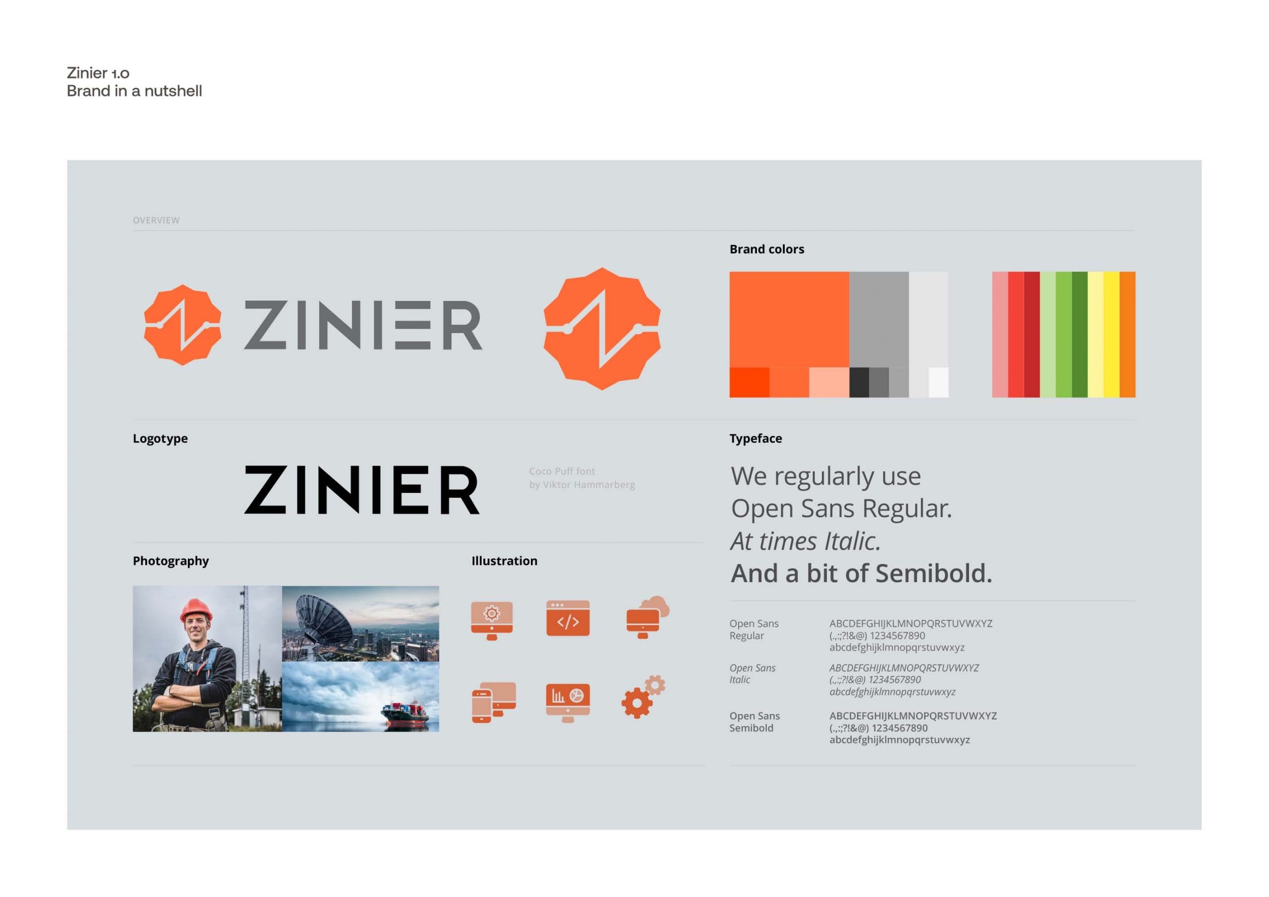
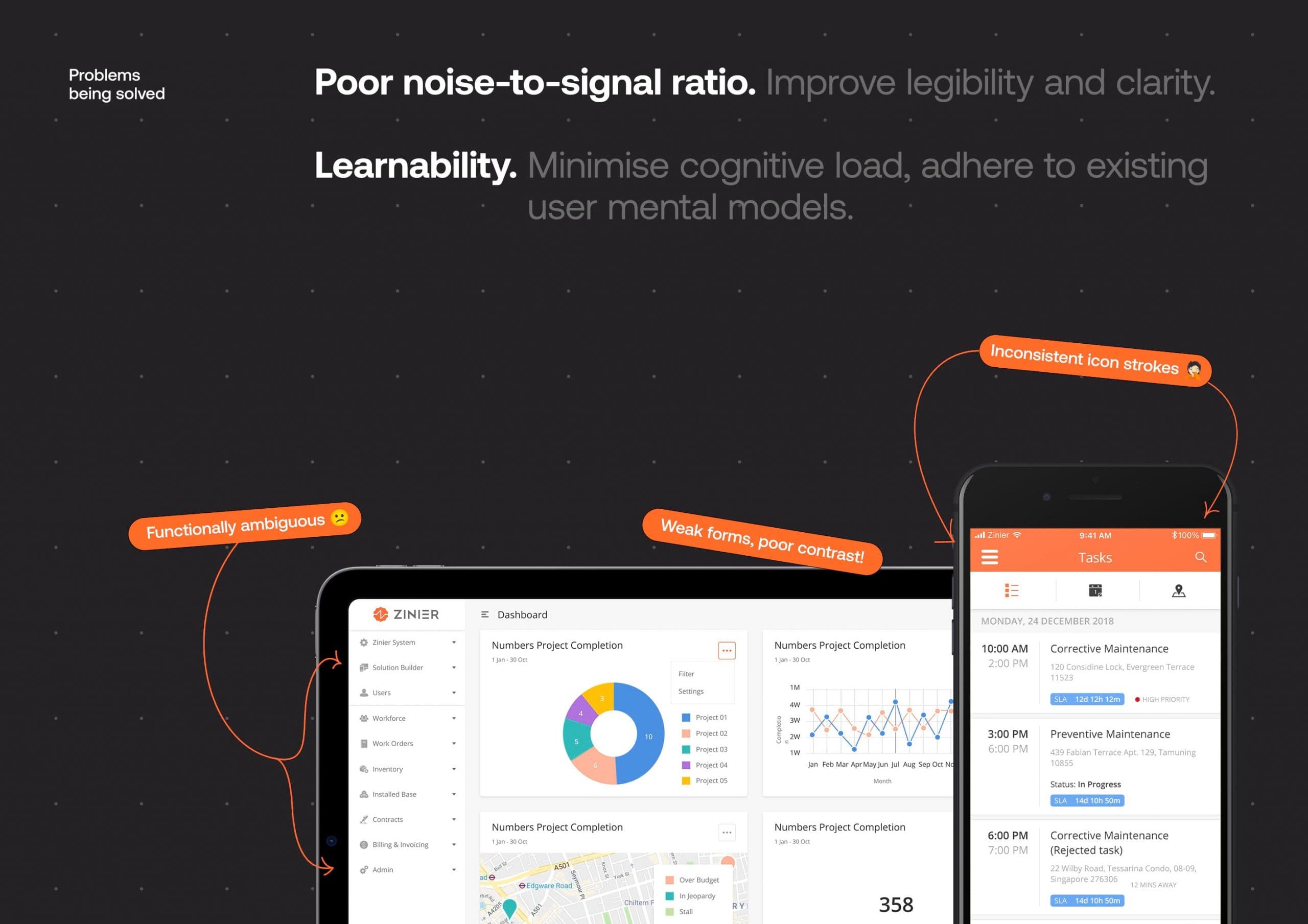
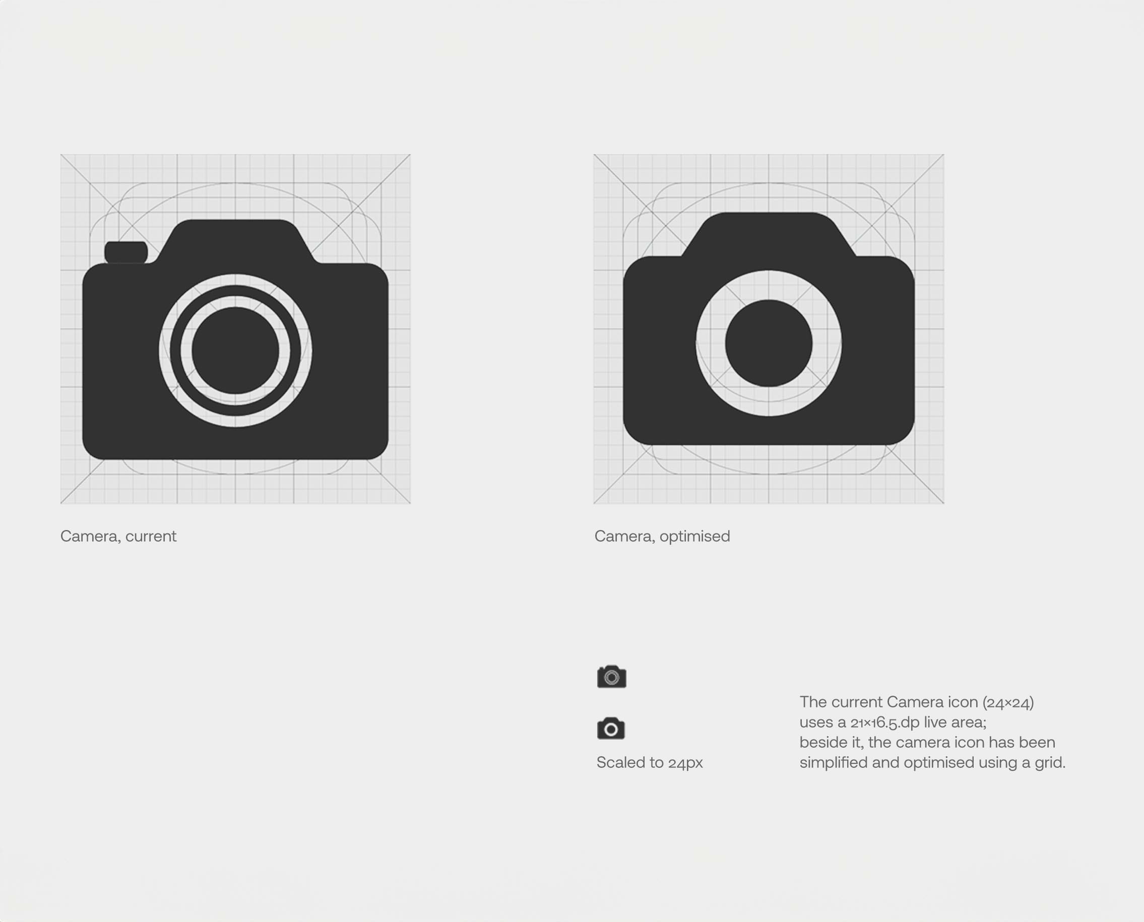
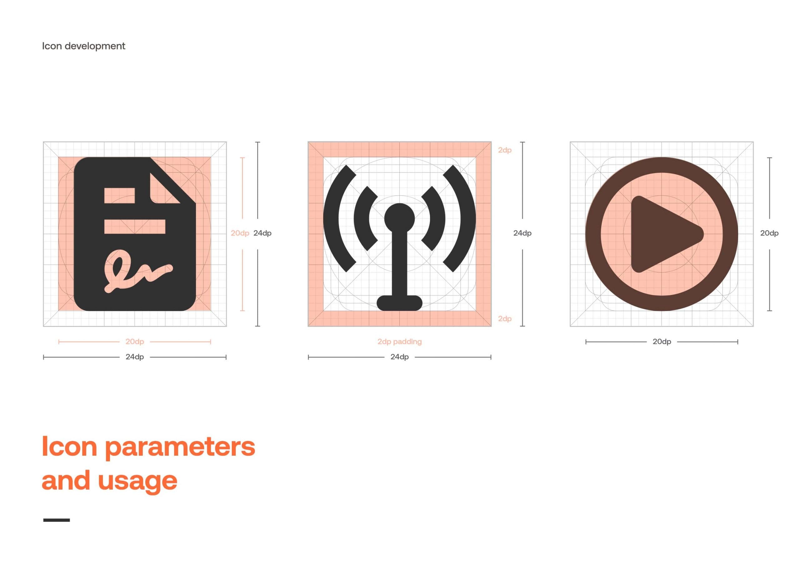
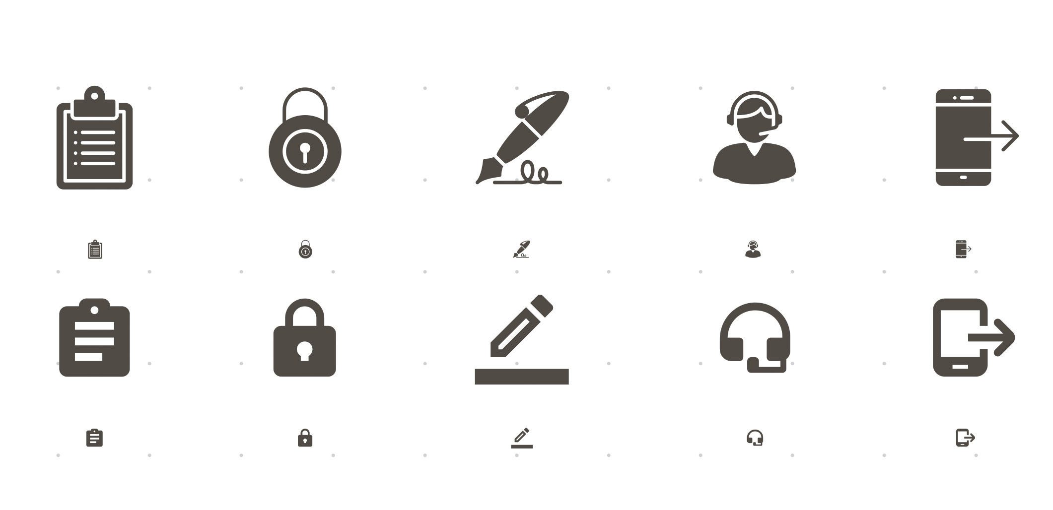
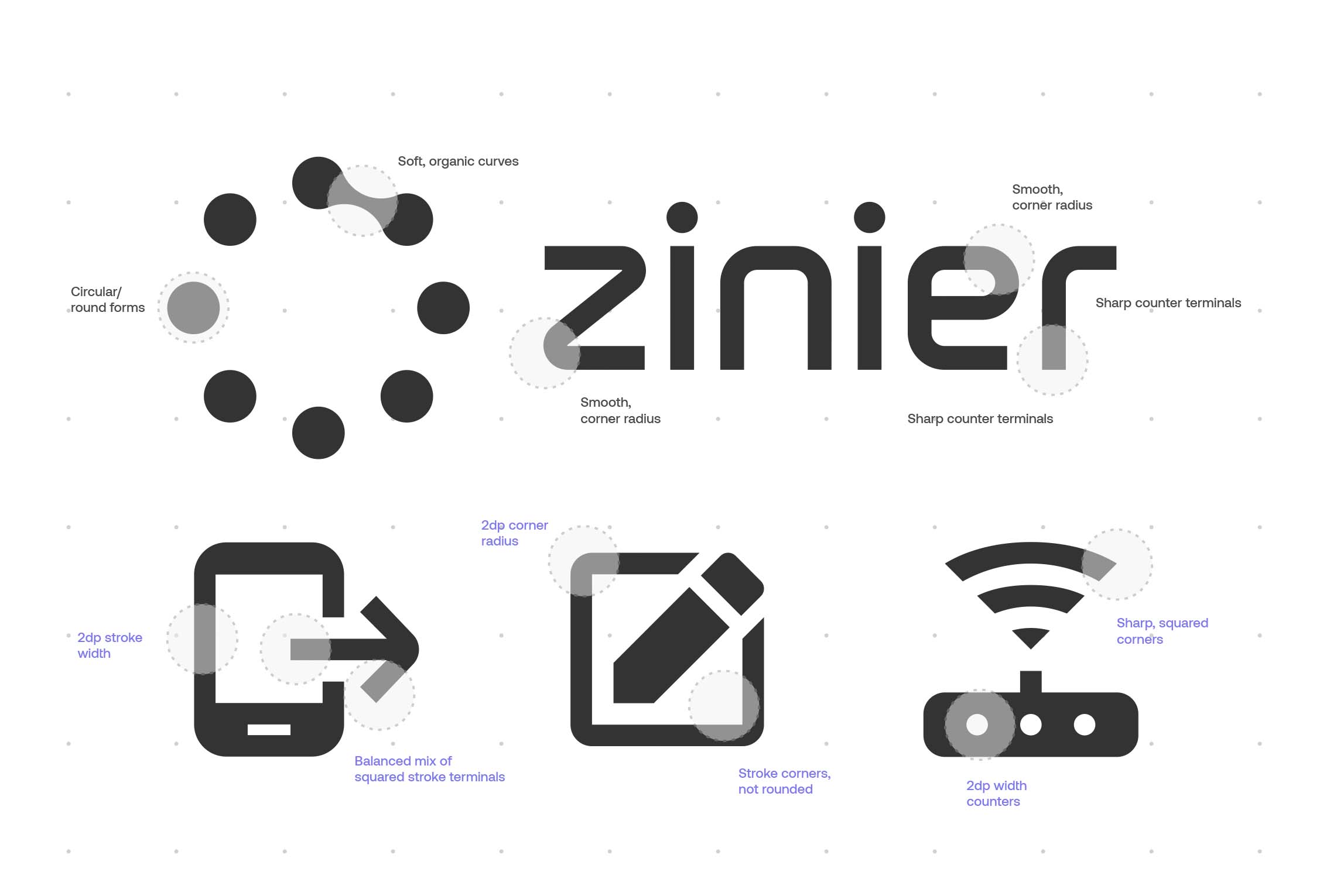
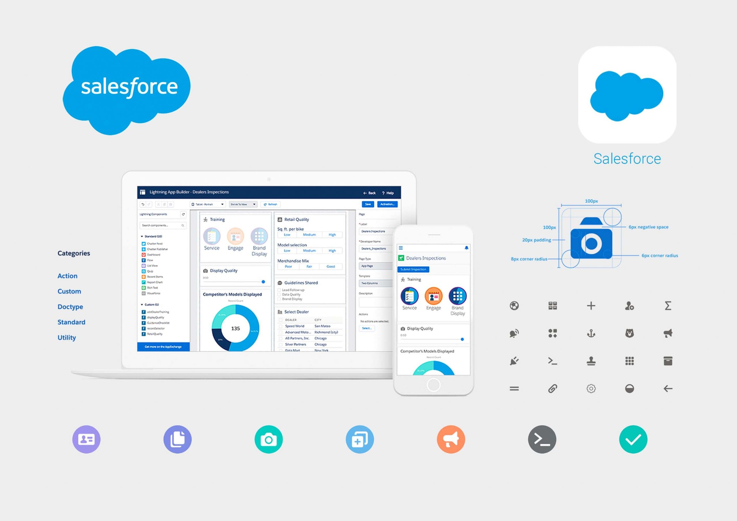
At small scale the icons looked too similar, creating incoherent app screens due to inconsistent geometry, curvature, and stroke widths.
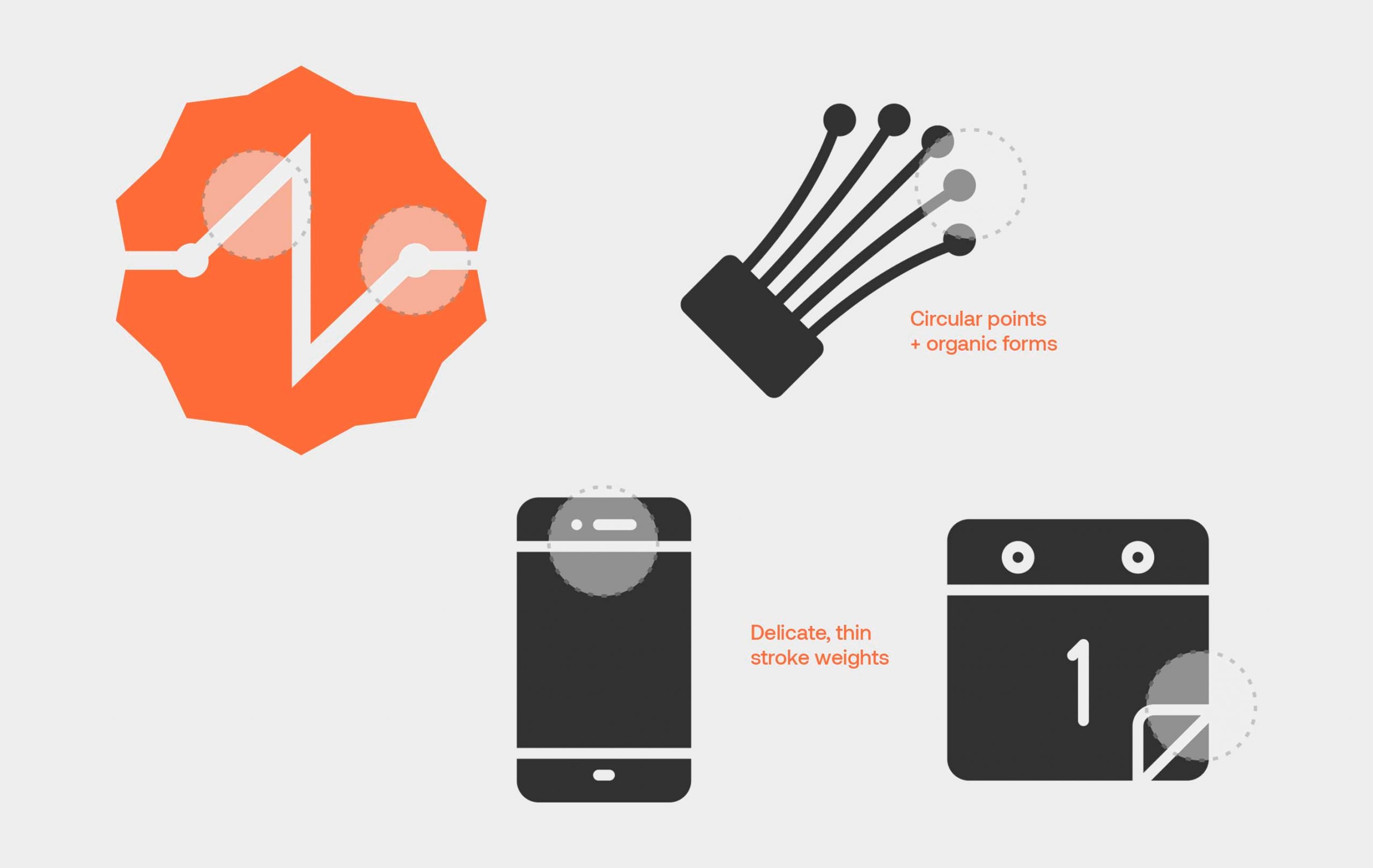
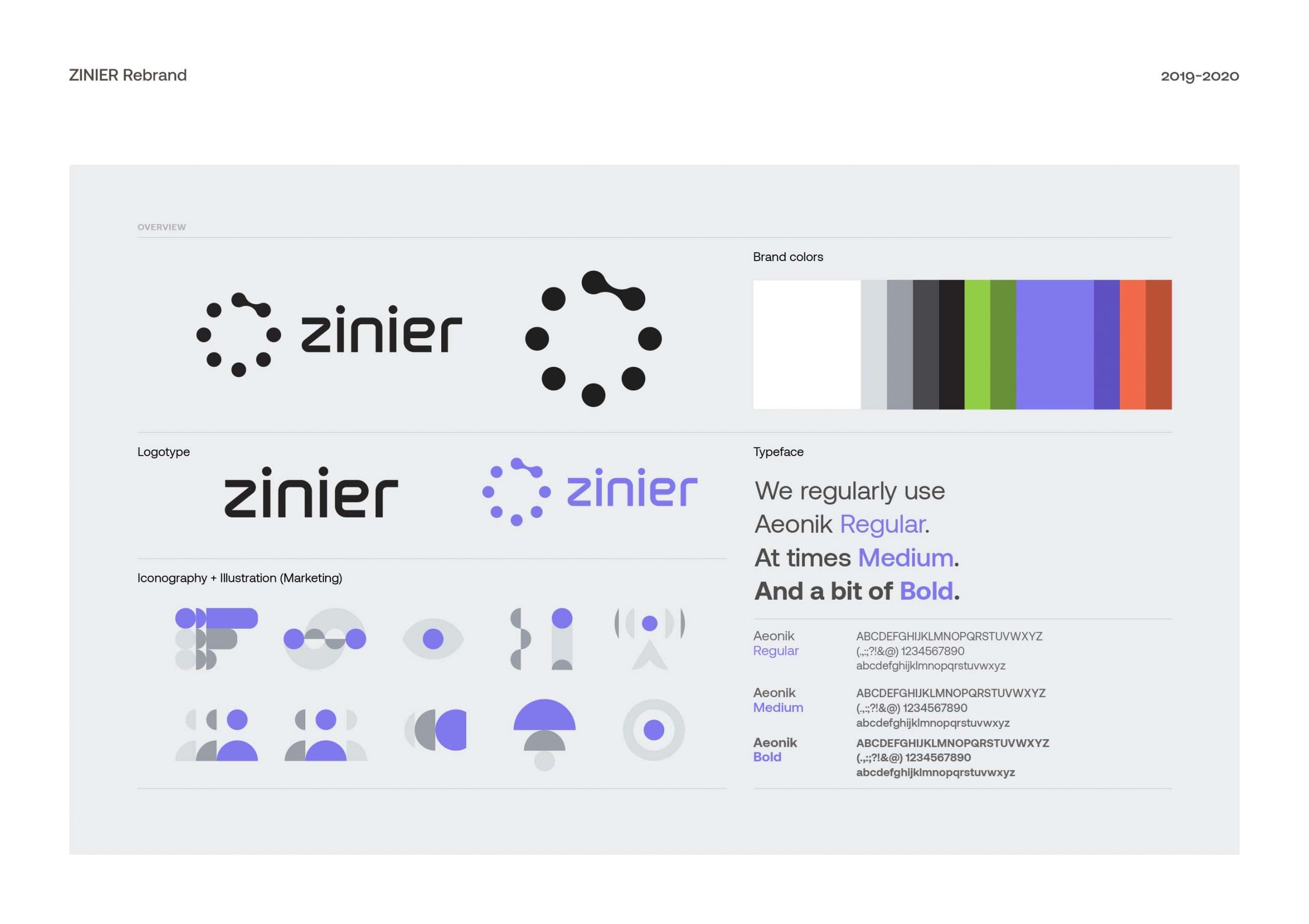
The brand logo’s counter strokes and rounded forms were evident in the existing icons. However, at smaller scales, delicate stroke weights blurred, making icons indistinguishable across the interface.
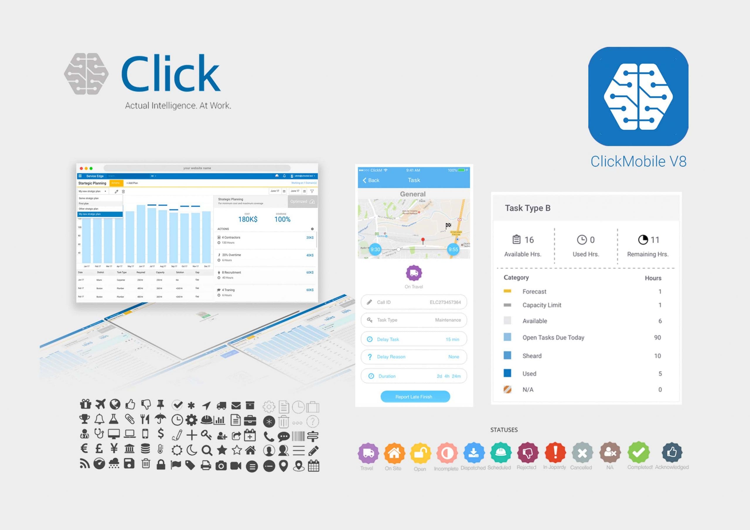
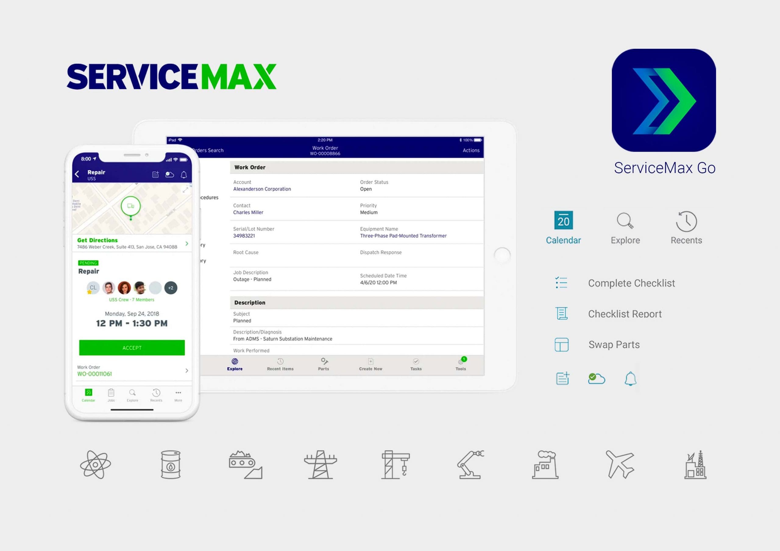
Benchmarking competitor interfaces & icon systems. Here’s a screencap at what other players in the field are doing which I compiled on the onset.
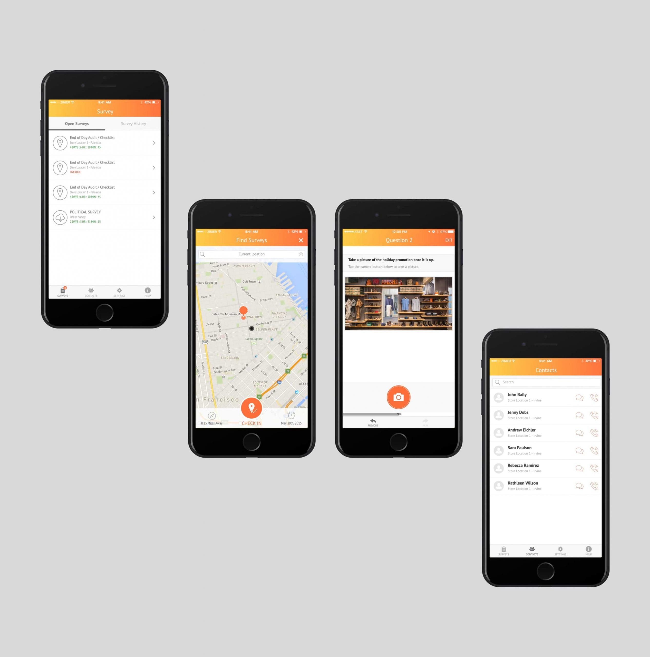
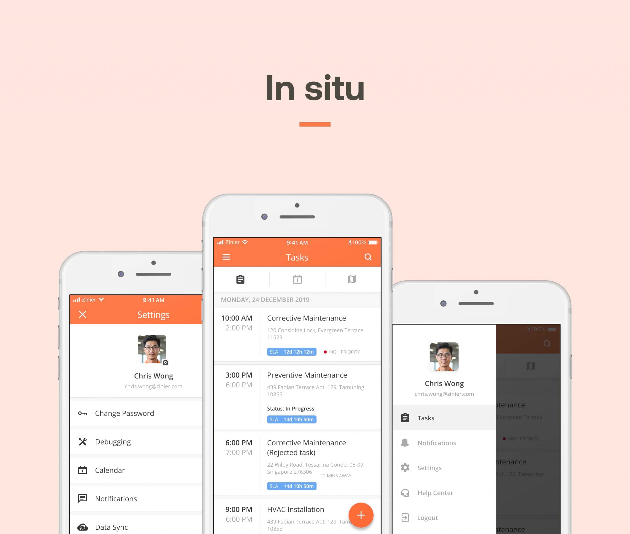
The OG Zinier app (circa 2018). This is what the Zinier app looked like when it first launched in the App Store. (Last updated listing 31 Mar ’18).
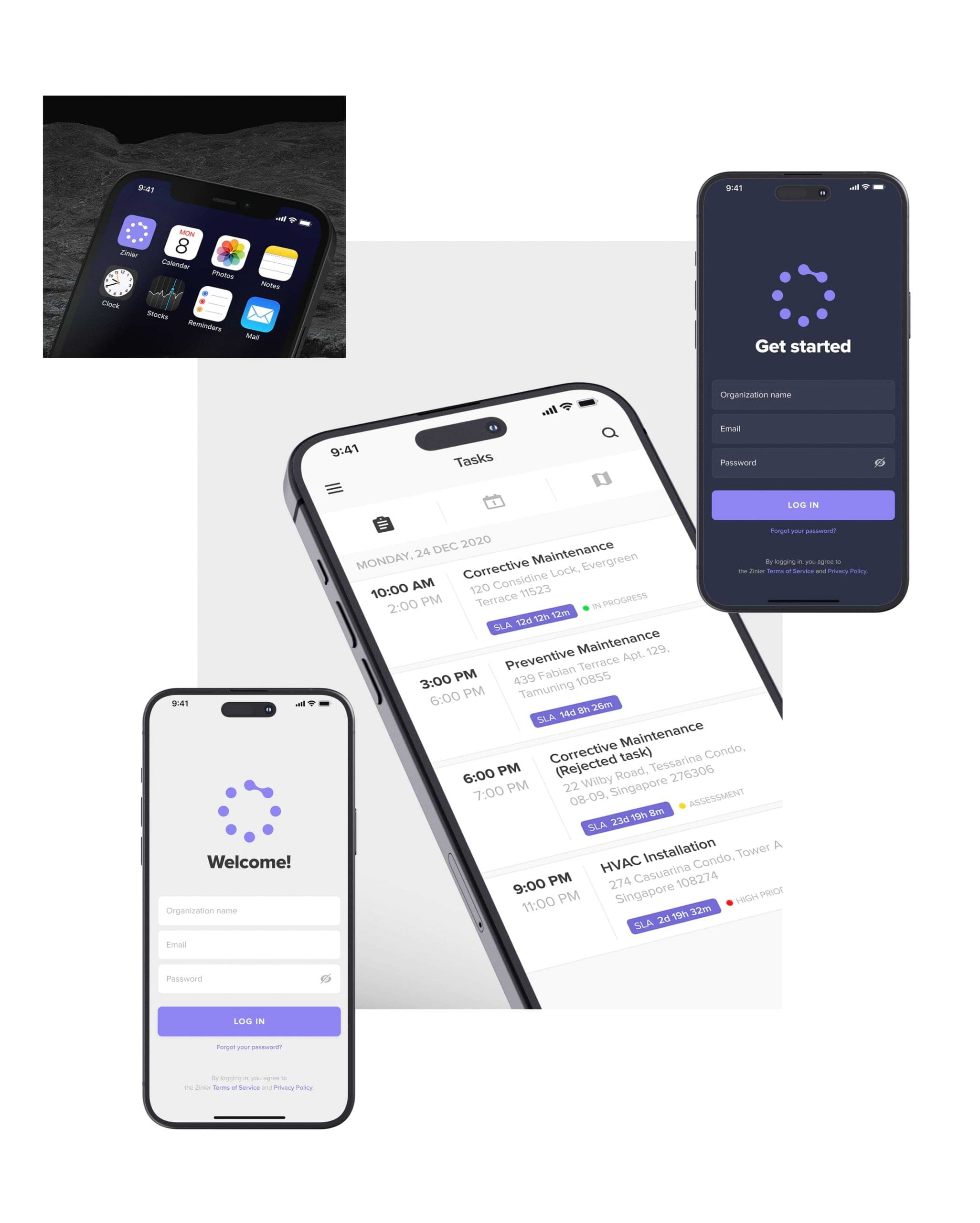
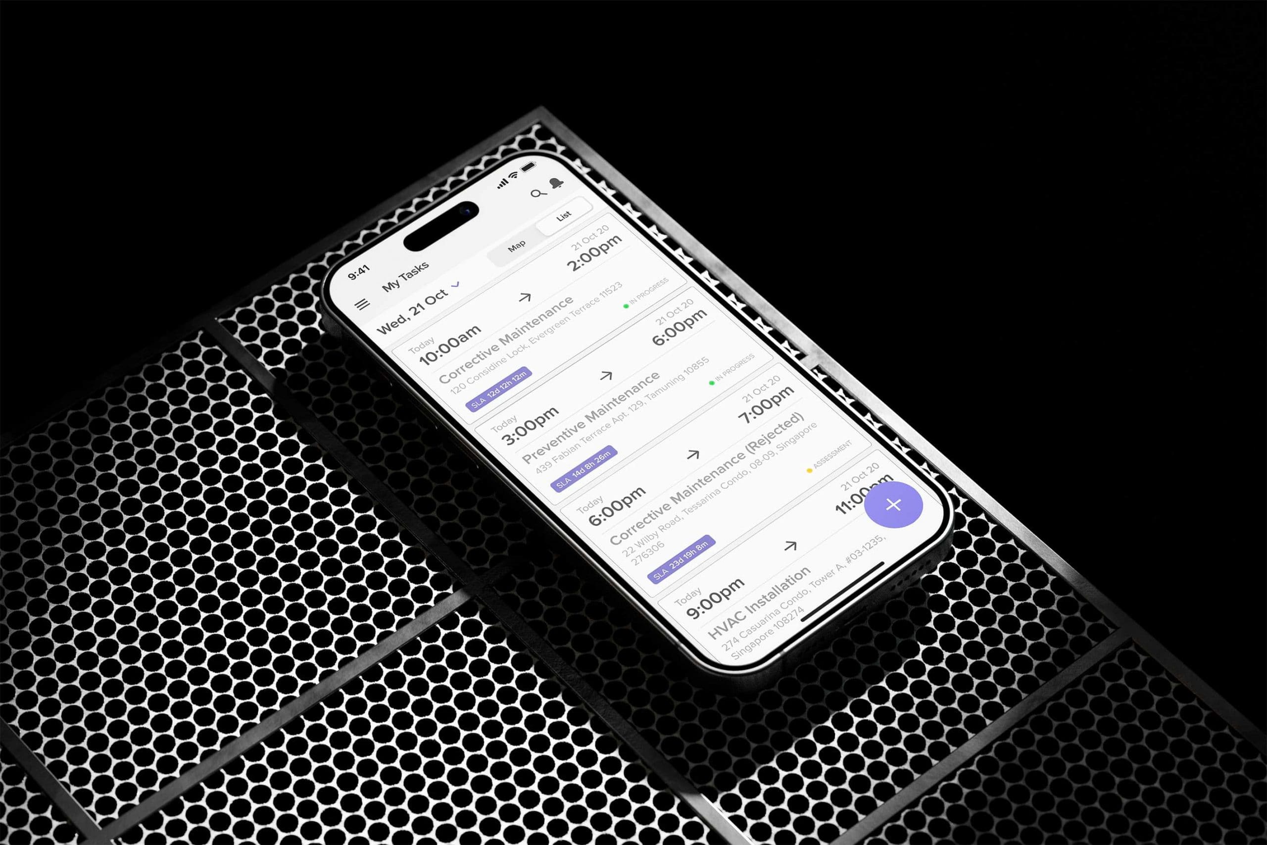
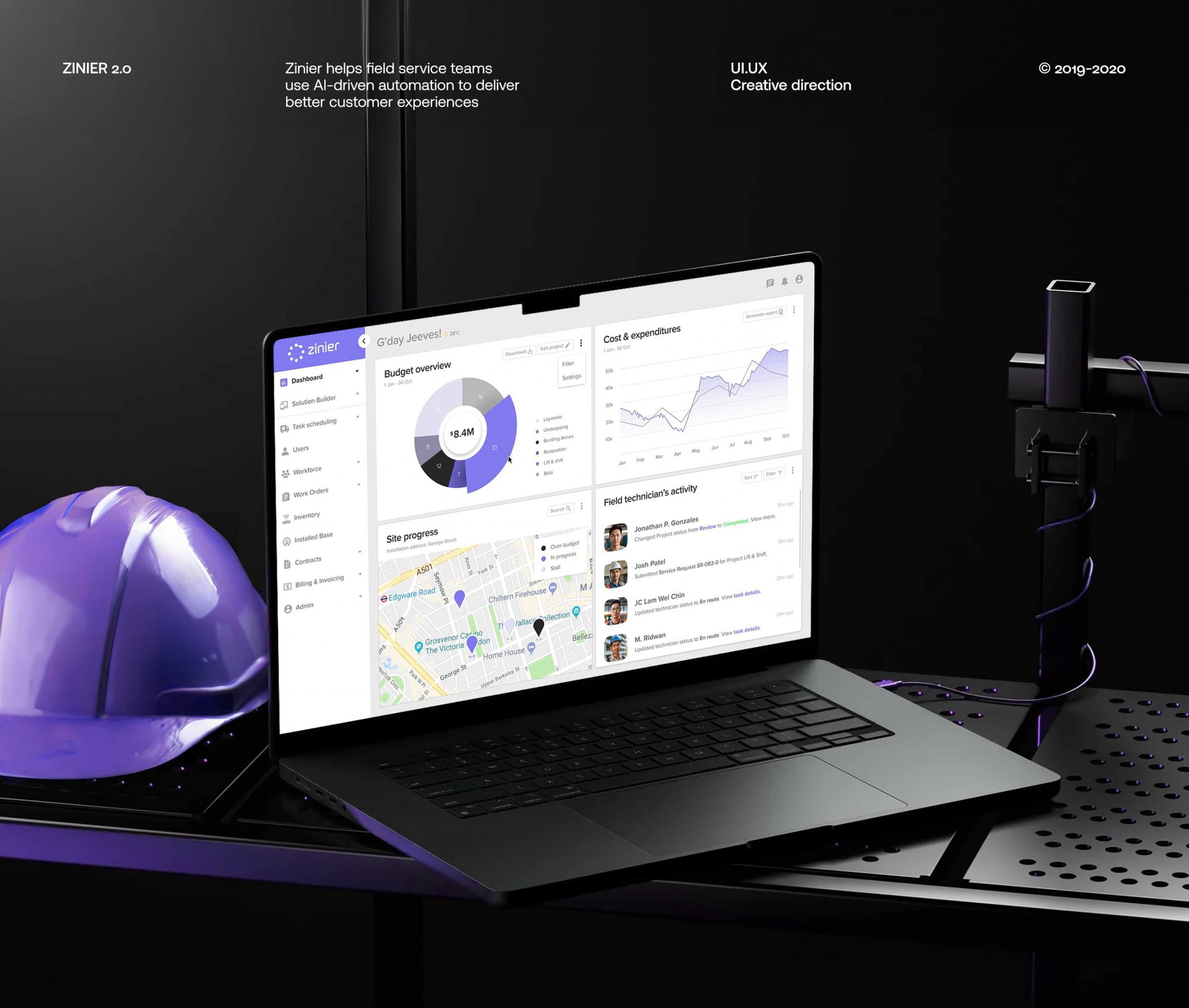
Zinier HQ (2018) launched as a mobile hub for retailers, offering features to track tasks, streamline communication, enforce brand consistency, and translate corporate strategy to store-level actions.
Building a foundation for clarity, I standardized attributes like: [1] minimum stroke width, [2] consistent corner radius, and [3] balanced negative space to ensure readability at all sizes. A grid system further ensured consistency in dimensions and proportions across all icons, creating a visually cohesive and user-friendly set.


Pixel perfect clarity at any condition. Yup, from scratch! The final icon library wasn’t just visually cohesive, it was built for real-world use.
Every icon is pixel-snapped for crisp rendering in Illustrator, ensuring clarity even under extreme conditions. This is crucial for technicians, as they’ll be using the app under harsh sunlight, in dimly lit environments, or both. Prioritizing pixel-perfect icons guarantee strong findability and clear distinction, no matter what the weather throws their way.


Design curveballs

I identified key design characteristics for the icon visual treatments. Consistent traits and stylistic similarities ensure the new icon set feels cohesive and unified.


The result? A cohesive design system that strengthens brand recognition and enhances user experience across the Zinier platform.


Overcoming obstacles: A focus on user needs
Limited UX focus. Zinier is still in the early stages of building a strong UX culture. I recognized that pushing for a complete UI overhaul might not be the most strategic. Instead, I focused on user needs and gathered feedback from internal teams (field technicians, developers, marketing) and key stakeholders in our Silicon Valley headquarters. This feedback loop proved invaluable.
During the prototyping stage, the new icon library received overwhelmingly positive feedback from field technicians. They praised the clarity and intuitiveness of the icons, suggesting they would significantly improve workflow efficiency (based on user testing).
- Enhanced clarity and usability. The new UI design prioritizes intuitive icons and leverages familiar design elements to reduce cognitive load and accelerate learning. Faster onboarding and clear visual language minimize confusion and improve user experience.
- Strengthened brand identity. The cohesive, distinctive icon set reinforces brand recognition and builds a stronger brand image.
While post-launch data on response times and error rates is unavailable due to my departure from the company before launch, the positive user feedback during testing strongly suggests a positive impact on service delivery. Clearer icons likely facilitated faster task completion and reduced errors, leading to minimised downtime and potentially improved customer satisfaction.
The new mobile app, designed specifically for field technicians, streamlines information capture and automates updates to supervisors. Step-by-step workflows guide technicians through tasks, providing real-time progress visibility.
The in-app camera (which I also worked on) integrated seamlessly with the new icons, allowing technicians to capture data, attach photos to work orders, and annotate directly from their devices. These features, packaged in an intuitive and user-friendly experience, drive app adoption and empower technicians to work faster and more efficiently.
While post-launch data specific to Zinier’s icon redesign is unavailable, several case studies showcase the significant impact of clear communication design in field service applications:
- Increased efficiency. Studies report a 45% rise in first-time fix rates and a 10% reduction in mean-time-to-resolution. Additionally, field teams completing 2x as many daily tasks and a 90% reduction in task approval clicks highlight significant efficiency gains (Source, 18 Mar 2021).
- Improved customer satisfaction. Clear communication can also lead to happier customers. One case study details a 50% increase in completed tasks, with factors like technicians being “properly equipped” and improved mobile app communication contributing to a success rate jump from 70% to 98.8%. Positive customer feedback also rose by 24.5%, with excellent feedback on corrective tasks increasing from 80% to 99.6% (Source, 12 Jan 2022).